Brandkit
The JUST APE IT brand kit: exact colour values, typography, the mark and the rules for remixing them. Free to use, no permission required.
Everything below is the actual system this website is built from, with the real values. Take it.
01The mark
The mark isthe full stop.
"JUST APE IT." is an instruction, and the thing that makes it an instruction rather than a suggestion is the period. So the period is the logo: a solid signal-yellow square, set on the baseline.
It is pure geometry, so it needs no font to render, scales to any size without loss, and still reads at 16px in a tab bar — which is more than a monkey, a rocket or a three-letter monogram can manage.
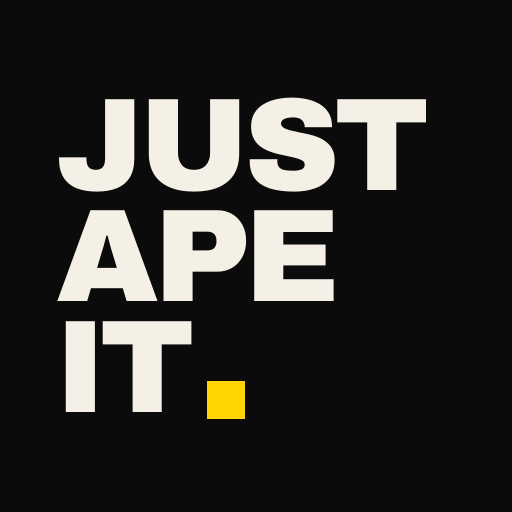

On ink, on signal, on bone. Never on a photograph.
02Colour
Eight values.One accent.
Ink
#0B0B0BGround. Everything sits on this.
Ink Deep
#050505Alternating sections.
Raise
#111111Panels and data surfaces.
Line
#232323Hairlines. The structure of the whole site.
Bone
#F4F0E6Primary type. Warm, not white.
Bone Dim
#A09A8FBody copy and secondary type.
Signal
#FFD400The accent. Only ever means act.
Alarm
#FF4A2EWarnings and losses. Used sparingly.
03Typography
Two faces.
Archivo carries everything the brand says out loud. IBM Plex Mono carries everything it states as fact: indices, labels, data, addresses, legal. If it is a number or an identifier, it is mono.
Both are open source and free for any use, from Google Fonts.
Archivo · 900 · display
Just ape it.
Archivo · 400 · body
Stop researching the decision you have already made.
IBM Plex Mono · 500 · labels and data
Solana · $APE · Est. 2026
04Rules
Five rules.Then do whatyou want.
- 01
Yellow means act
Signal yellow is reserved for things a person can do and things they must not miss. The moment it becomes decoration it stops working, and the site loses its only loud voice.
- 02
No rounded corners
Nothing on this brand has a radius. Not buttons, not panels, not images. It is the single fastest way to stop looking like every other landing page on the internet.
- 03
Type is the artwork
Set it huge, tight and uppercase, and let it dominate. If a layout needs a decorative element to work, the type is not big enough yet.
- 04
Hairlines, not cards
Structure comes from 1px rules on a grid. No drop shadows, no glass, no floating panels, no glow.
- 05
Keep the phrase, wreck the rest
JUST APE IT is the one thing worth keeping consistent. Everything else — the colours, the layout, the mark — is yours to take apart. There is no approval process and there is not going to be one.
Last section. Obviously.
You’ve thoughtabout itlong enough.
Stop thinking. Start doing.